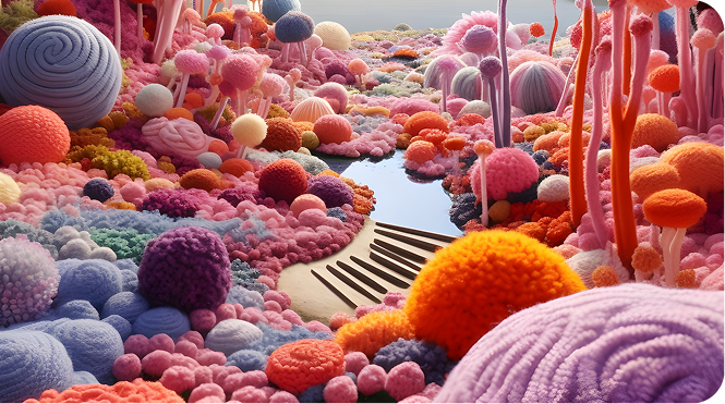
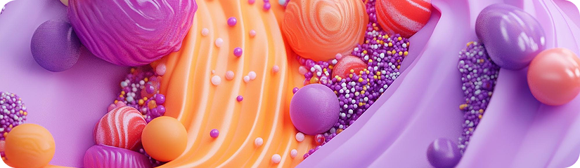
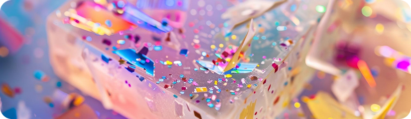
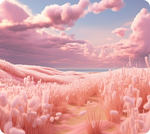
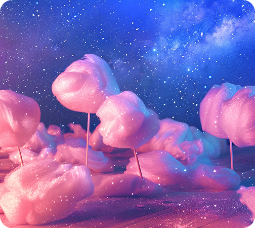
A digital journal dedicated to the study of how colour affects emotion, behaviour, and perception. Sugarflow blends visual creativity with aesthetic psychology, celebrating candy-inspired tones that spark joy and imagination. We explore the relationship between sugary hues and the human mind — how soft pinks reduce anxiety, why violet encourages creative problem-solving, and how gradients can turn ordinary content into delightful experiences.
READ MOREBecause in an overwhelming and sometimes dull digital world...
At Sugarflow, we believe life tastes better with colour. Our mission is to empower designers, brands, and everyday creators through knowledge of emotional colour interaction. We want to make digital spaces more comforting, more optimistic, and more beautiful.
Sweet shades reflect our emotional history (childhood memories, treats, celebrations)
Pastels make technology feel human and friendly
Glowing and gradient tones encourage exploration and engagement
Soft hues increase dwell time and user trust
Our articles are designed to be visually rich and easy to digest — like a bite of a favourite dessert. Every post combines psychological insight, colour theory and aesthetic references from art, fashion, and tech.
Soft pink doesn’t just look sweet — it nurtures the nervous system.
This article explores why pastel
blush
tones reduce anxiety, the role of early-life colour associations, and how warm pinks create a digital
atmosphere of empathy and kindness.
We break down how purple stimulates abstract thinking, encourages confidence in unusual ideas, and enhances user curiosity. Includes palette inspirations drawn from gaming universes, editorial fashion, and mood-driven campaign visuals.
We analyse why gradients evoke emotional depth — combining movement, light and flavour-like transitions. Learn how designers can build trust through smooth colour evolution and create delight with candy-like finishes.
A new era of sweetness in marketing.
Pink and violet brands aren’t “girly” — they’re powerfully inviting. This article traces the cultural shift
toward approachable, emotionally-aware identities, and explains why “cute” equals high
To make navigation tasty and fun, our editorial is divided into flavour-inspired themes:
Case studies and expert commentary on how colour impacts mindset. We connect emotional reactions to marketing outcomes and UI comfort.
Interface design featuring glossy buttons, soft cards and delightful shadows. We showcase real products embracing youth-centric candy energy.
Design that feels plush and gentle — perfect for wellness and lifestyle brands. Subtle power through comfort.
Hyper-saturated pinks and violets that pulse with neon happiness. Where pop culture meets Web3 aesthetics.
Our gallery is a visual escape — a moodboard in motion. Bright, glossy visuals stimulate creativity and help creators think differently.
We’d love to hear from you — whether you’re pitching a collaboration, requesting a palette review, or simply saying hi.
Sugarflow — Design Editorial Brisbane, AU
239 George Street, Brisbane QLD 4000, Australia
+61 3 2891 0946